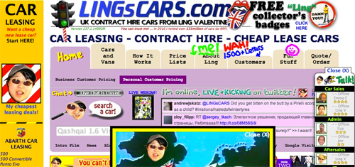
Let’s face it, most Advisers websites quite simply suck. Our research shows us that for new traffic to your website, more than 98% of that traffic will make the ‘About Us’ tab their very first click.
Advice is a ‘trust’ business, and the reason that people go to About Us is to find out about ‘the people’…and what do they get? The same old Blah Blah Blah. It should be no surprise that the average time visitors stay ‘on page’ is less than 10 seconds!
Your website should have a two-prong focus, 1) To engage and capture opportunities that you are creating from your digital strategy for prospective new clients, and 2) To deliver education, service, and information to your existing clients.
In fact, the two should be separate functions and may even be provided by two completely different sites. However, we will focus on the aspect of new business attraction in this article and will write about structuring your site for existing clients later on.
For converting new prospects to clients, the aim is to build trust and remove the ‘fear of the experience’ from a perspective clients mind. You should be looking to capture the opportunity and make a connection, whether by email or other Social Media so that you can continue to build a relationship beyond ‘the visit’.
Having a HIGH VALUE proposition in exchange for an email address is a good example, such as the Social Advice mini course that is available for free subscription on www.thesocialadviser.com . In fact, most of the many thousands of people receiving this email subscribed to our email list in this way.

Most Advisers websites are literally overflowing with information that is both overwhelming and quite frankly BORING. You need to be taking a strategic and staged approach to ‘click progression’ that instead is simple, compelling and connects to the emotional decision-making centers of your visitor’s brain. Basically, you need to be WAY more personal and just make things SIMPLE.
There is a lot of science to the art of effective web design for Advice businesses and it is something that we at The Social Adviser have been obsessed with for a long time. we’ve found that a large part of the problem is that Web Designers have NO IDEA how to structure a website to actually produce a result for you. Following that path will cost you money and a hell of a lot of wasted opportunities.
